Grounded yoga
Grounded Yoga is a brand rooted in realness. Built as a counterpoint to the polished, hyper-commercial yoga scene, it offers a stripped-back, inclusive space for people who want to move, breathe, and reconnect — without the mirrors, mantras, or manufactured glow. This is yoga without the performance.
The Project
Grounded came with a clear mission: build a brand identity that reflects their no-frills, all-feels approach to yoga. The challenge was to create a system that felt thoughtful but never precious — something that would resonate with their diverse, grounded community while still standing out in a sea of pastel athleisure and curated Instagram aesthetics..
The Solution & Impact
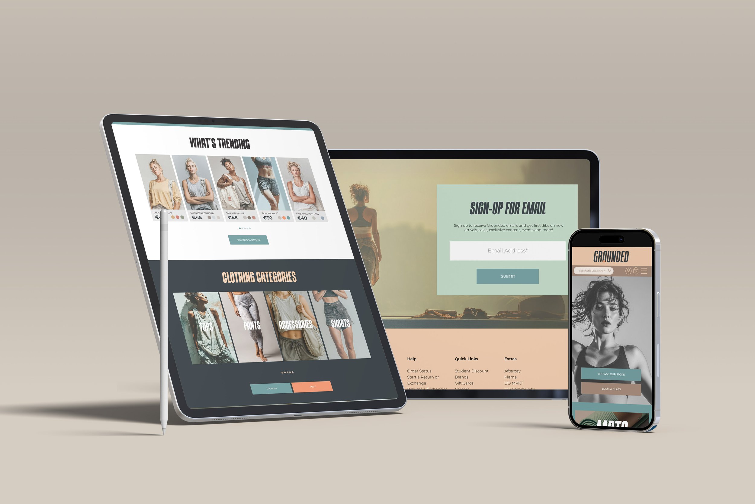
We designed a visual identity that strips away the fluff and holds space for honesty. The logo is clean and confident — more presence than posture. An earthy, tactile colour palette replaces typical wellness tones, while typography balances clarity with character. Across print, signage, and a bold but bare website, the brand speaks with intention, not performance.
The result? A brand that feels like the practice: grounded, honest, and accessible. Students who had felt pushed out by commercial yoga culture now see themselves reflected in a space that doesn’t ask for perfection. The new identity doesn’t just support Grounded’s growth — it affirms their purpose. It’s yoga, redefined.